Web & App Design
Amigo
Overview
Amigo is a B2B SaaS product that helps you automate your sales and marketing data to Google Sheets. Our product centralizes data across Shopify, Google Ads, Facebook Ads & 20 + data sources. It helps you create, automate, send, and manage reports. It empowers anyone in the company to get actionable sales and marketing insights in real-time to make data-driven decisions.
Role
I have been part of the Amigo team for the past ten months as a Product Designer. Within our company, which consists of 7 talented engineers, a marketing manager, a product analyst & dedicated founders, I am one of 2 designers.
Background
Ten months ago, I joined Amigo as a Product Designer, one of two designers in the organization. Alongside 7 exceptional engineers, a skilled marketing manager, a product analyst, and devoted founders, my role involves leading design efforts across the company. I focus on UX and UI for crucial application components on the platform.
Some of the key achievements are:
Turned an idea into a product - The journey of transforming an idea into a tangible reality has been nothing short of amazing. Collaborating closely with the founders and the team, I helped shape Amigo's product vision and strategy. Witnessing our significant growth and progress as a team and startup is truly sensational.
Developing an Understanding - Working on Amigo, a SaaS Data tool, was a bit challenging for me because I had little prior knowledge and wasn't an end user. To overcome this, I put myself in the users' shoes, understanding their frustrations and expectations. This approach helped me design with empathy and create a product that addresses their needs effectively.
Establishing a Design System - It has helped Engineering and Product teams understand our component choices through UX research and usability testing.
Understanding the Problem
Major problems faced by the companies:
Disorganized Data Management - Businesses struggle to effectively organize and manage scattered data, leading to difficulties in accessing and analyzing information and hindering decision-making.
Lack of Data Visualization - Inadequate data visualization tools limit businesses from interpreting data insights effectively, hampering informed decision-making and communication
Time and Resource Intensive Data Management - Manual data management tasks consume time and resources, impeding efficient decision-making and diverting attention from critical activities.

Defining Problem Statement
Problem Statement
Companies encounter obstacles that impede efficient decision-making and obstruct the optimal utilization of critical data. Manual management of information leads to errors, sluggish information access, and inadequate visibility into essential business metrics. To address these challenges, we seek a solution that enhances data governance, offers user-friendly visualizations, and enables advanced data analysis to empower teams with actionable insights.
Product Vision
The vision is to revolutionize the SaaS Data tool domain, transforming data management, analysis, and collaboration. The focus is enhancing data accessibility, visualization, and analysis through user-friendly interfaces and cutting-edge technology. Collaborative features foster teamwork and seamless data sharing, making data a strategic asset for businesses on the path to success.
About the Product
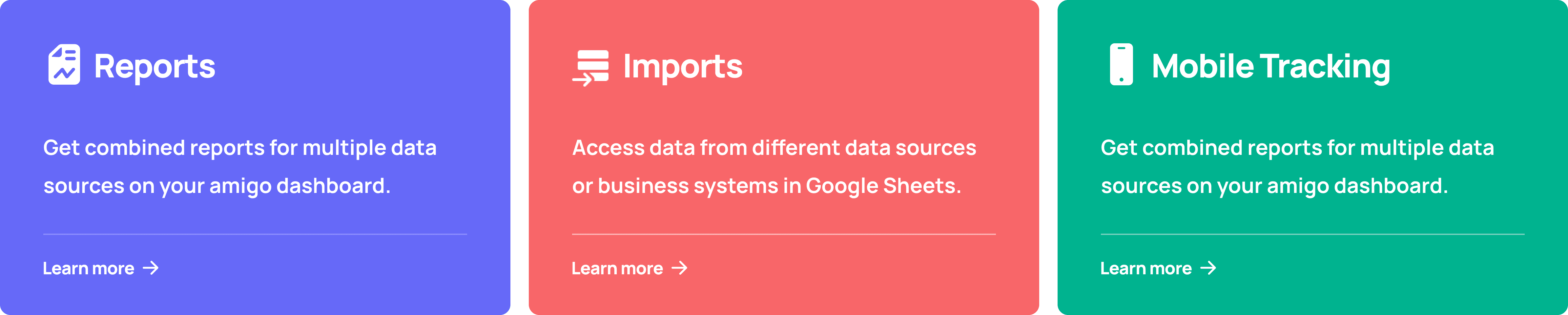
Amigo comprises of 3 different products:
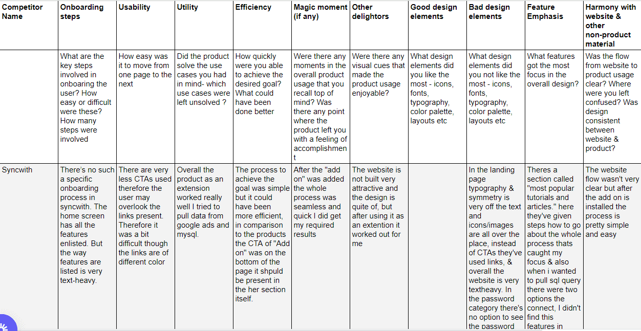
Competitive Analysis

Lets Talk About Designs
The whole process was iterative. At every milestone point, we conducted user testing to find the significant pain point setting. Once the feedback was gathered, I used to revisit the prototypes and test them again.
The idea was to keep everything clean, minimalistic and easy to understand so the user doesn't feel overwhelmed while using the product.
Design System

Landing Page
To effectively showcase your product, create visually appealing landing pages that communicate its features and benefits. Define the product's purpose and highlight critical features using concise language and visuals. Focus on user benefits, include testimonials, and use compelling CTAs. Optimize for mobile and conduct A/B testing to improve conversions. I have added the links for all the landing pages I've worked on Tryamigo.com, Imports, Pre-Set Reports, Integrations, Integrations - G sheet

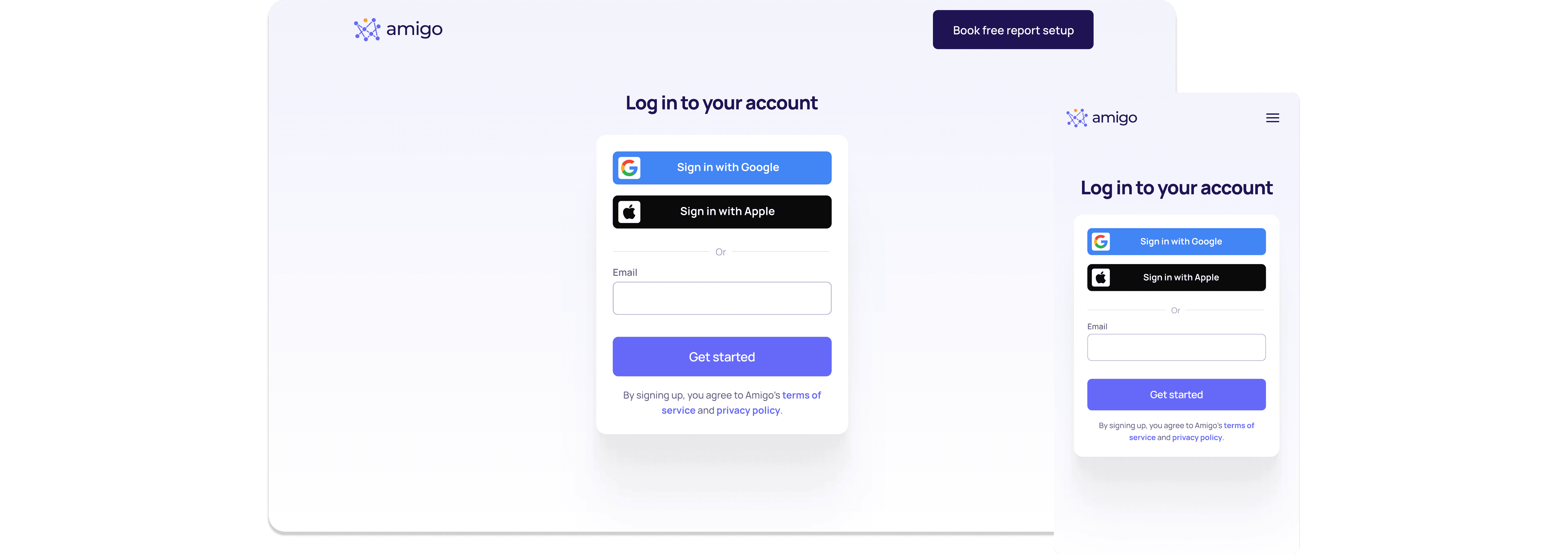
Sign Up / Sign In Page
A simple sign-up page allows users to log in or create a new account using email and Google.
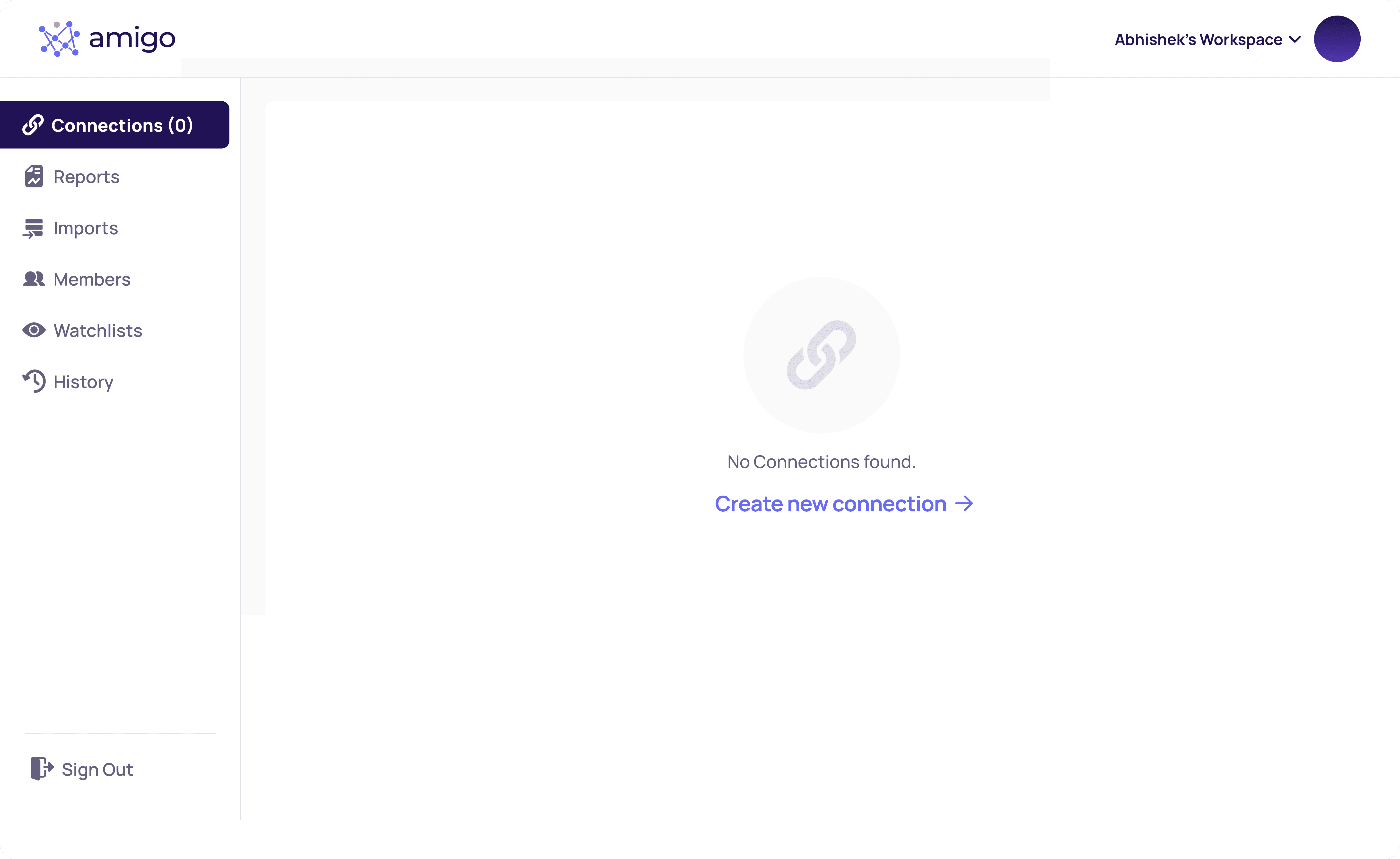
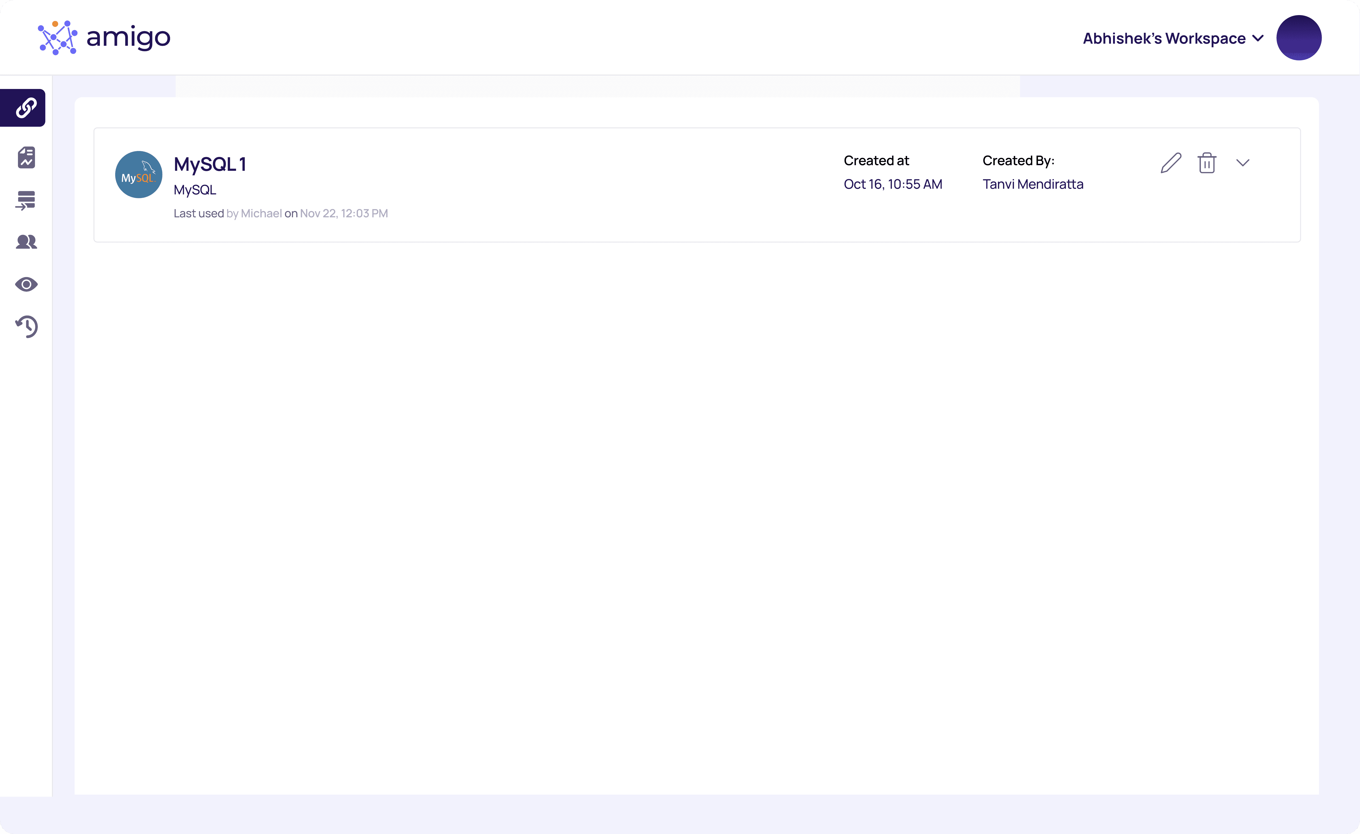
Connections Dashboard (For A New User)
Here's the connection flow for a new user:
1. The first step for any user is to create a connection for the desired integration.
2. Once the connection is created, the user can proceed to create imports, reports, and more.
Figma Prototype (Connections Flow)


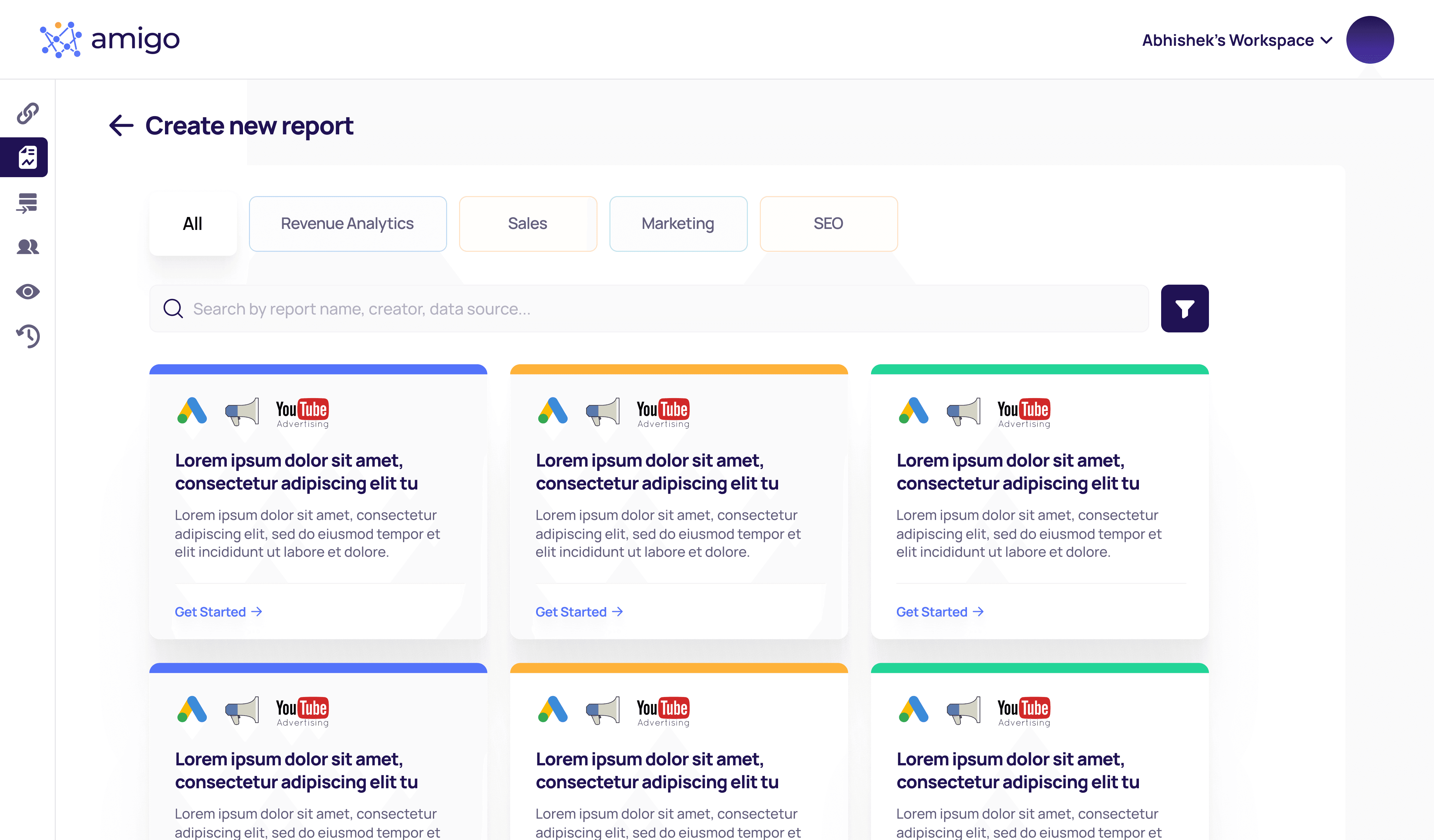
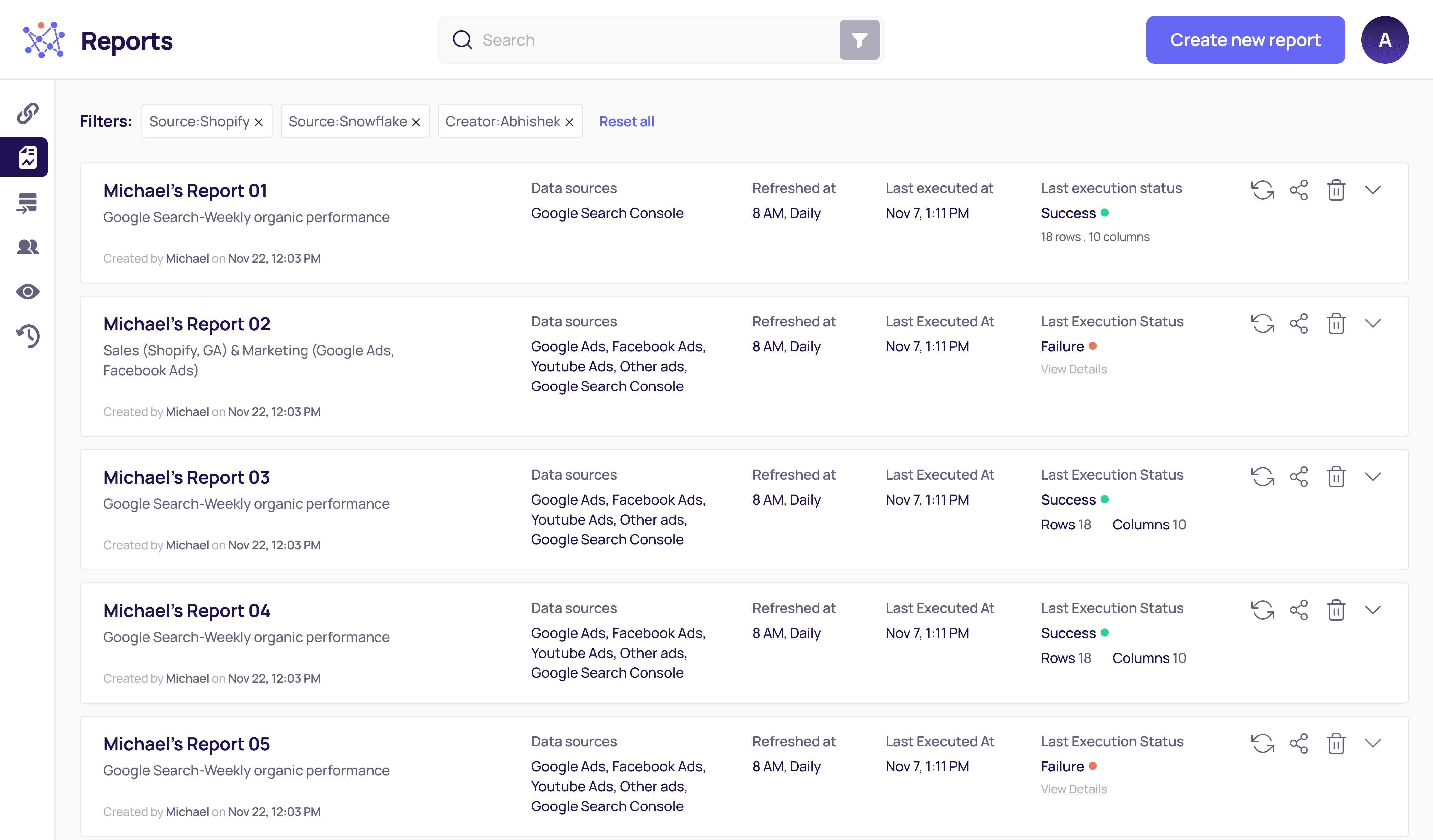
Automated One-click Reports
Users can build reports in seconds. I made the whole process easy here. Users have to choose a prebuilt library report, authenticate the data source, and run the report.
Figma Prototype (Reports Flow)


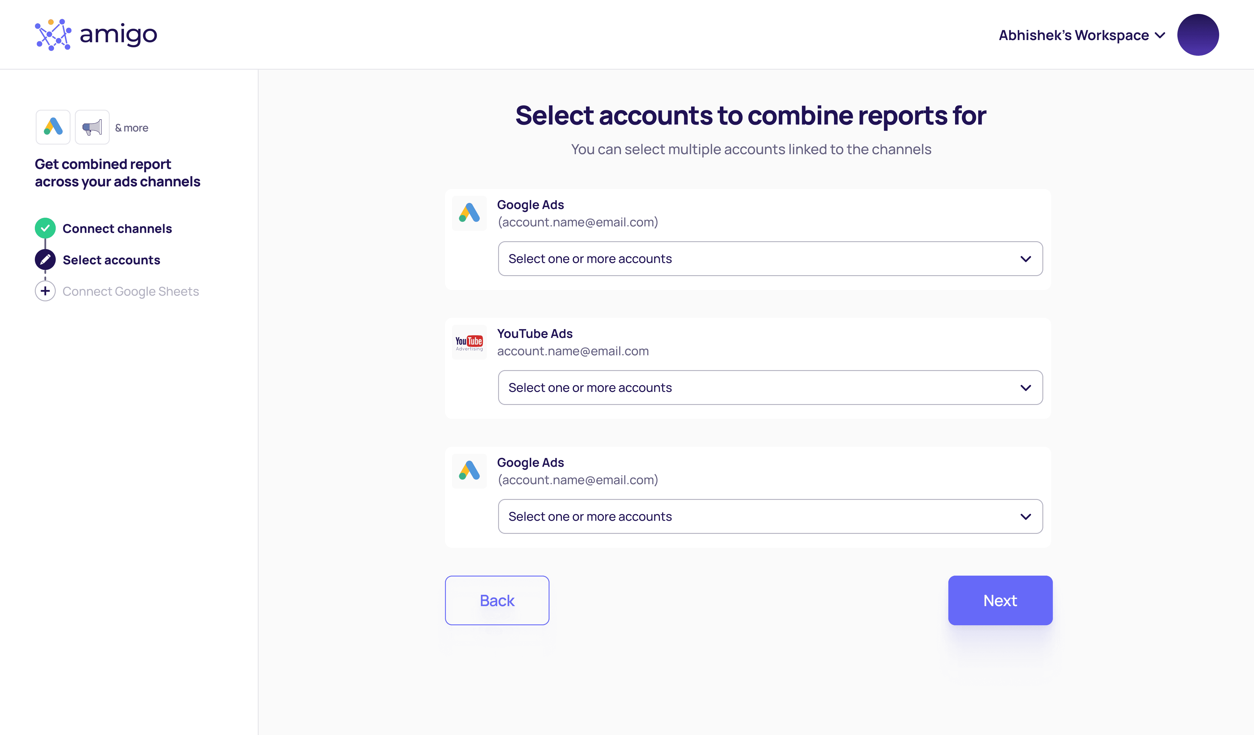


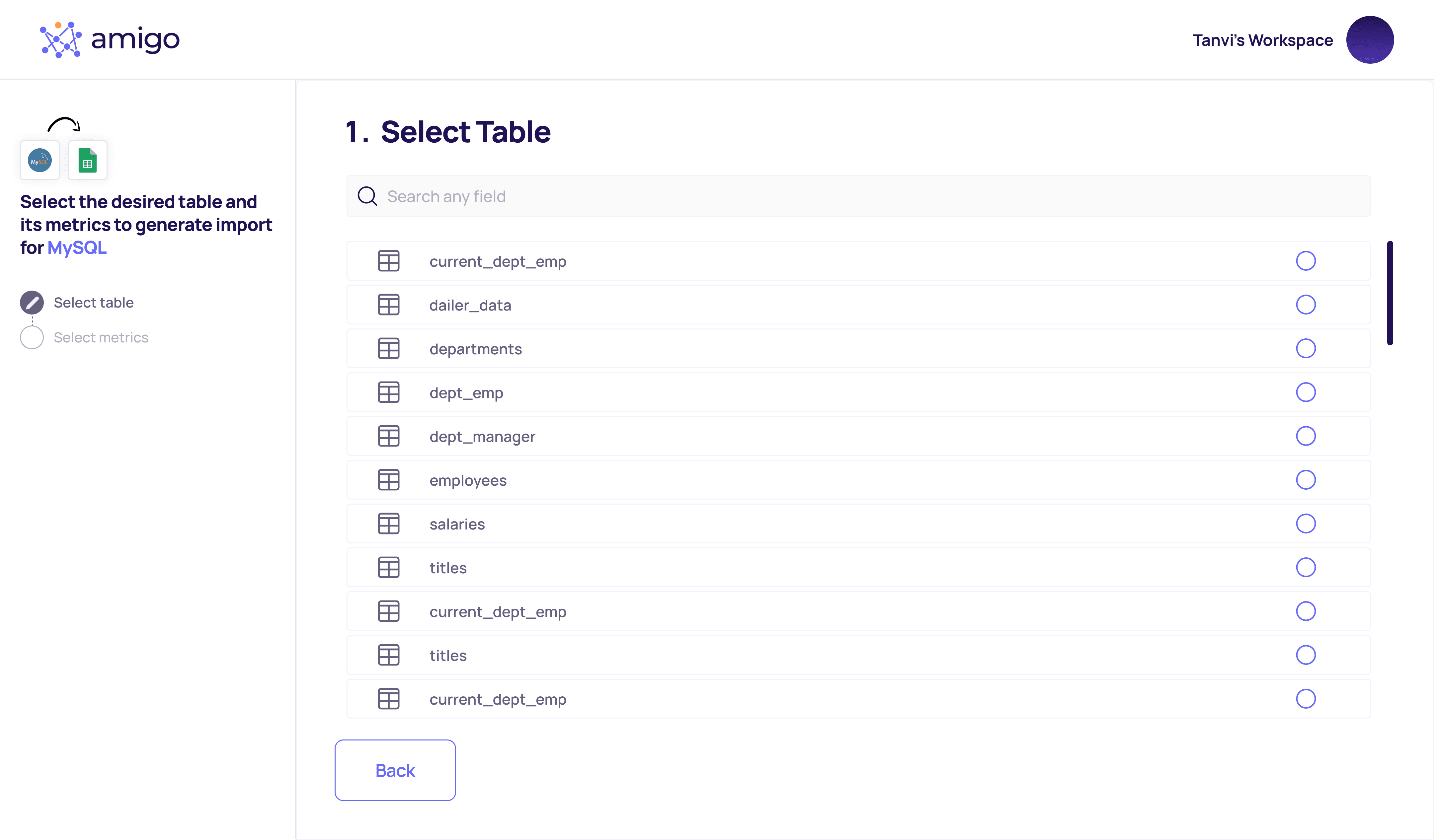
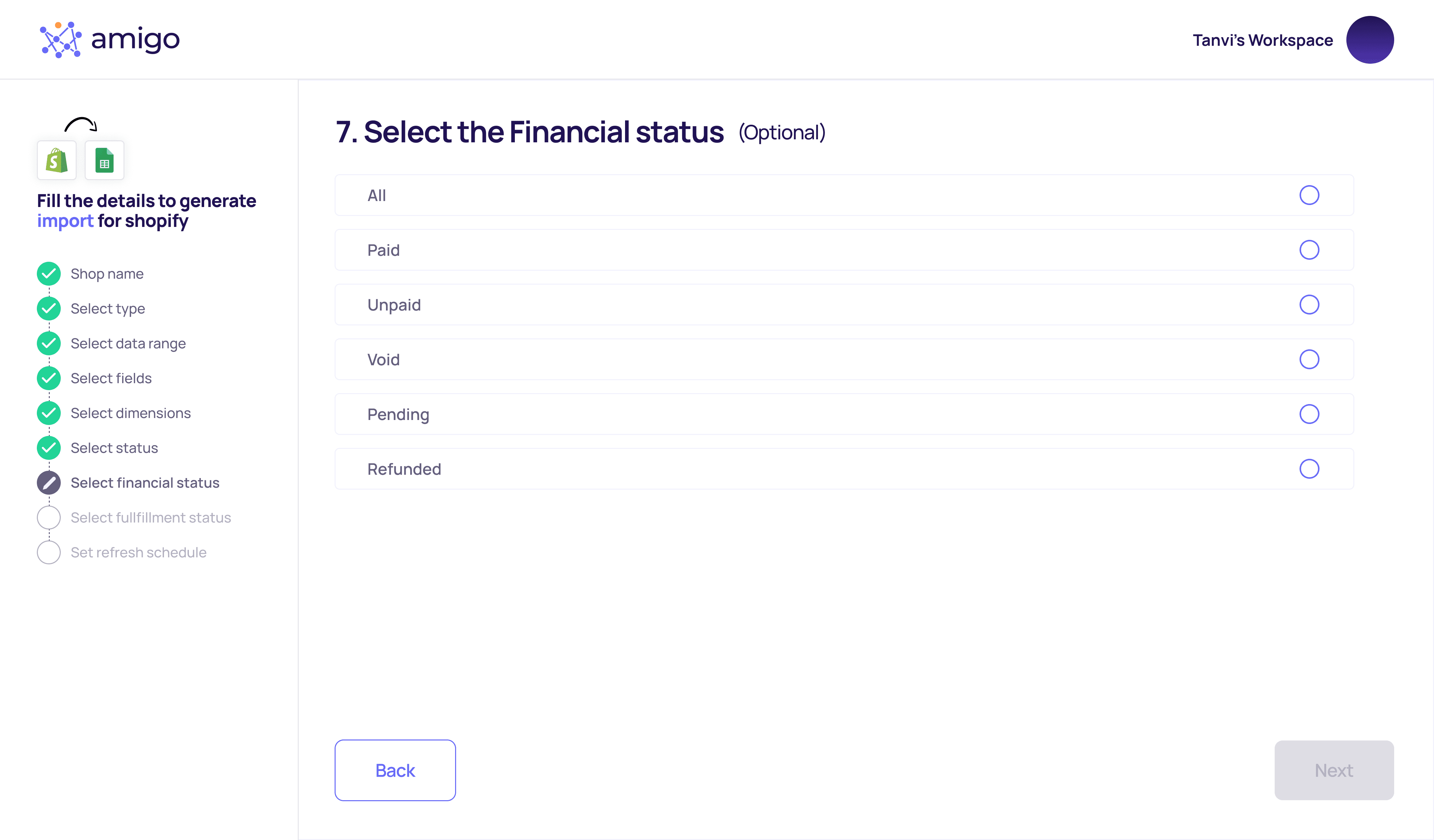
Imports Flow
Users can automate data to Google Sheets within seconds. But for that, users have to select several kinds of metrics and whatnot. To make that process hassle-free and not overwhelming, I created a typform-like process. Users can quickly fill out all the necessary details and get the desired updated data without manual effort.
Figma Prototype (Imports Flow)


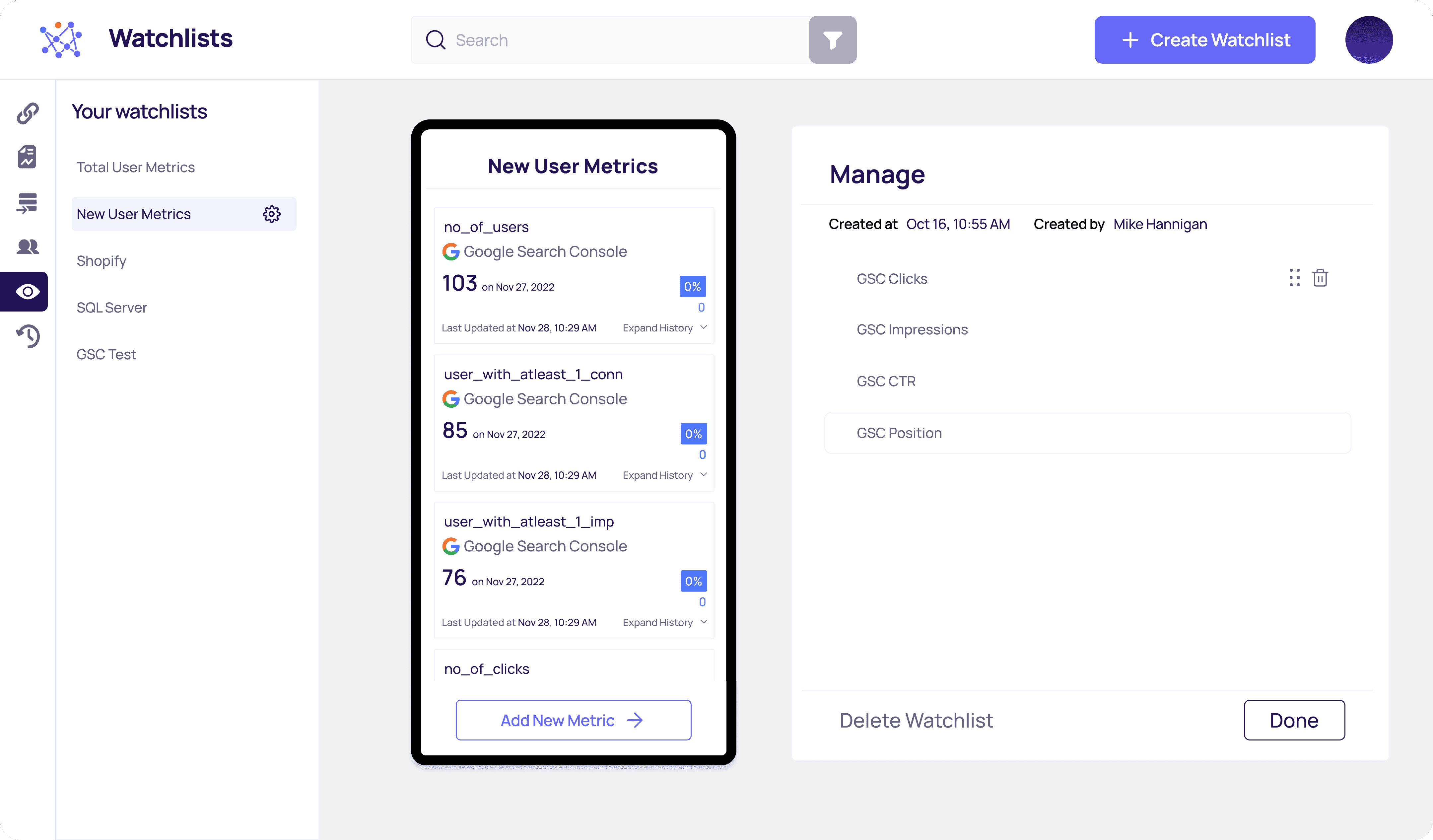
Watchlists Flow
This was the website version to track the KPIs, Get relevant KPI metrics curated by industry experts - Daily sales, spends, impressions, ROAS, CTR % much more. Users could easily create a watchlist from the web version as well and have 360-degree view of their businesses.
Figma Prototype (Watchlist Flow)


Site Map
Created a site map of the platform to help engineers understand how the overall site architecture worked.

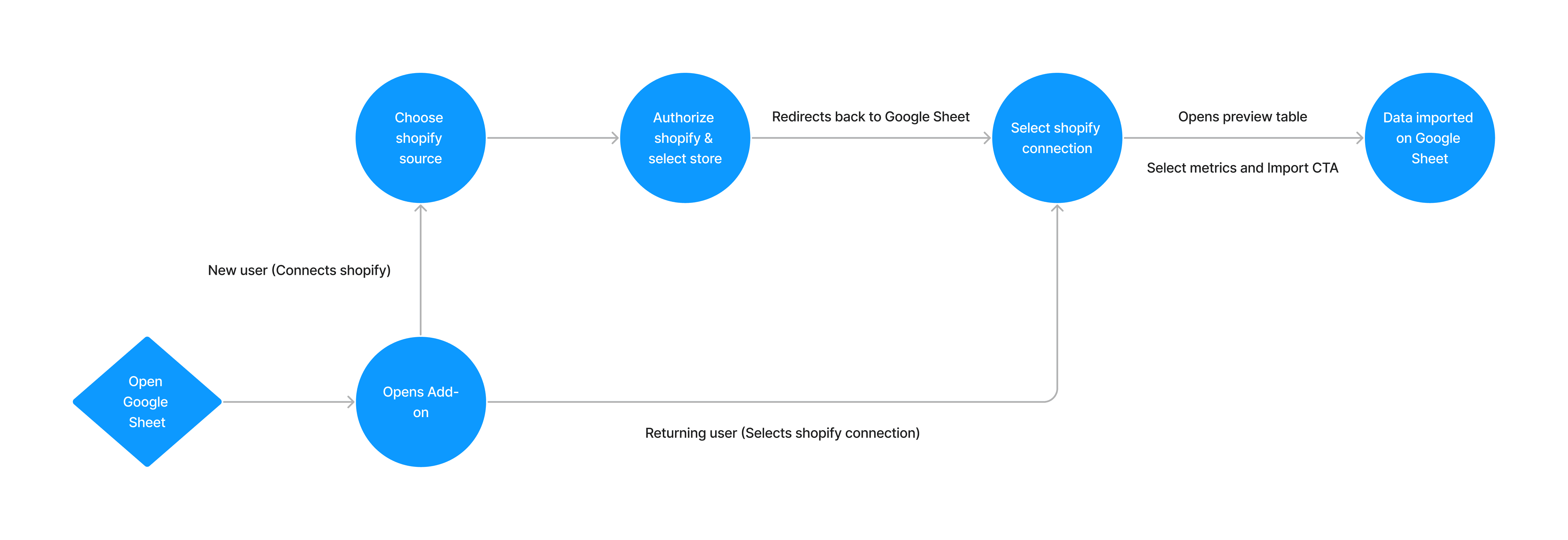
Flow for the Google Sheet Add On
Outcomes and viewpoints
Working in a start-up is sure a hell of a roller coaster ride. I enjoyed working and got to learn so much. It improved my learning curve. And I gained a lot of perspective as well.
Key Takeaways were:
Keep It Simple: Avoid feature creep and complexity. Stick to the core functionality that solves the primary user problems.
Identifying Pain Points: Clearly understand your target audience and their problems. Address these pain points through your MVP features.
Iterate and Improve: Continuously improve the MVP based on user feedback and market insights.
And the Results?
Significant decrease in the number of complaints lodged
Received positive feedback from users about the simplified configuration
2x
Convertion Rate